Email us at hi@forge.coop and we'll get back to you within 24 hours.
A new digital experience for a leading student funding platform
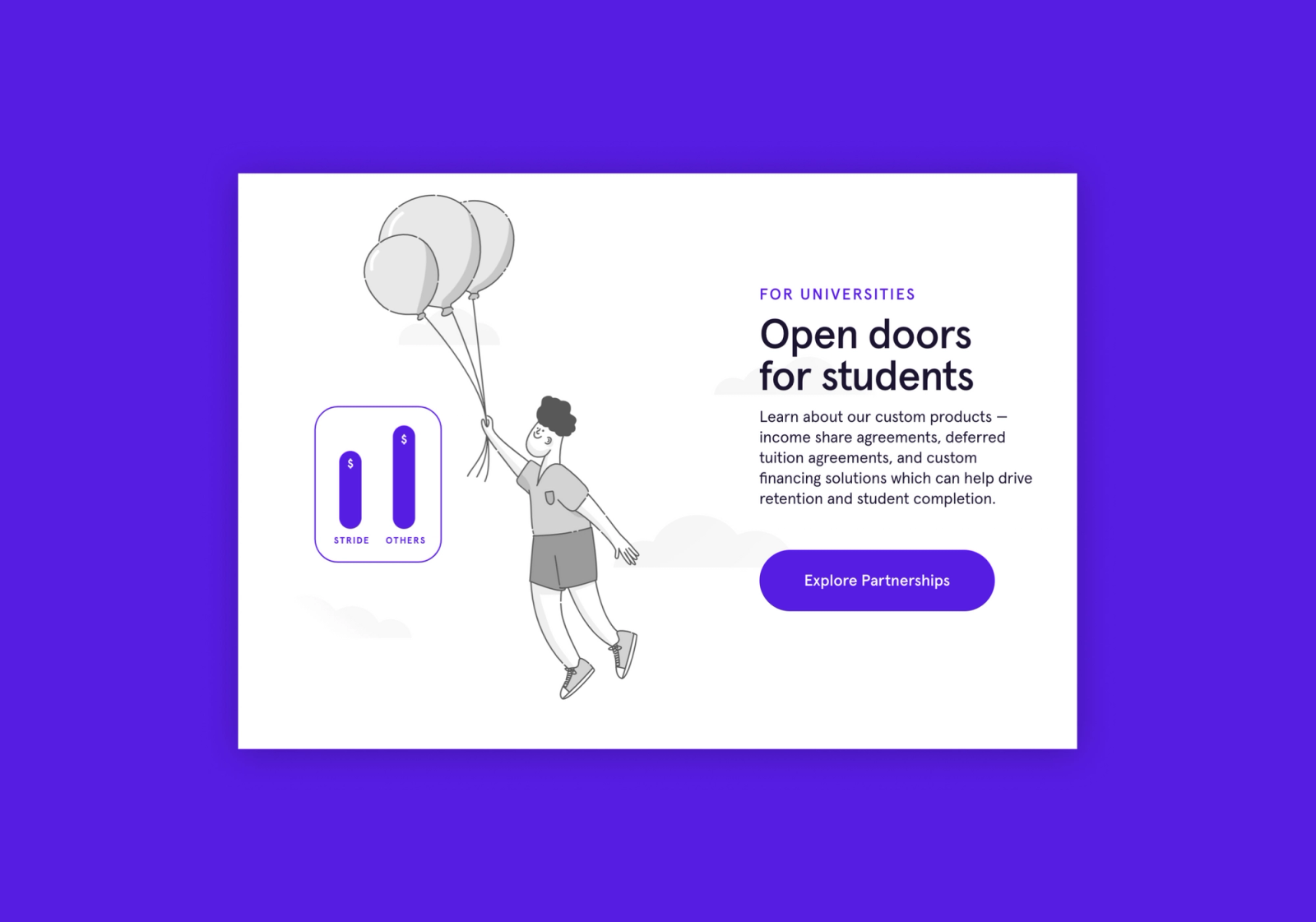
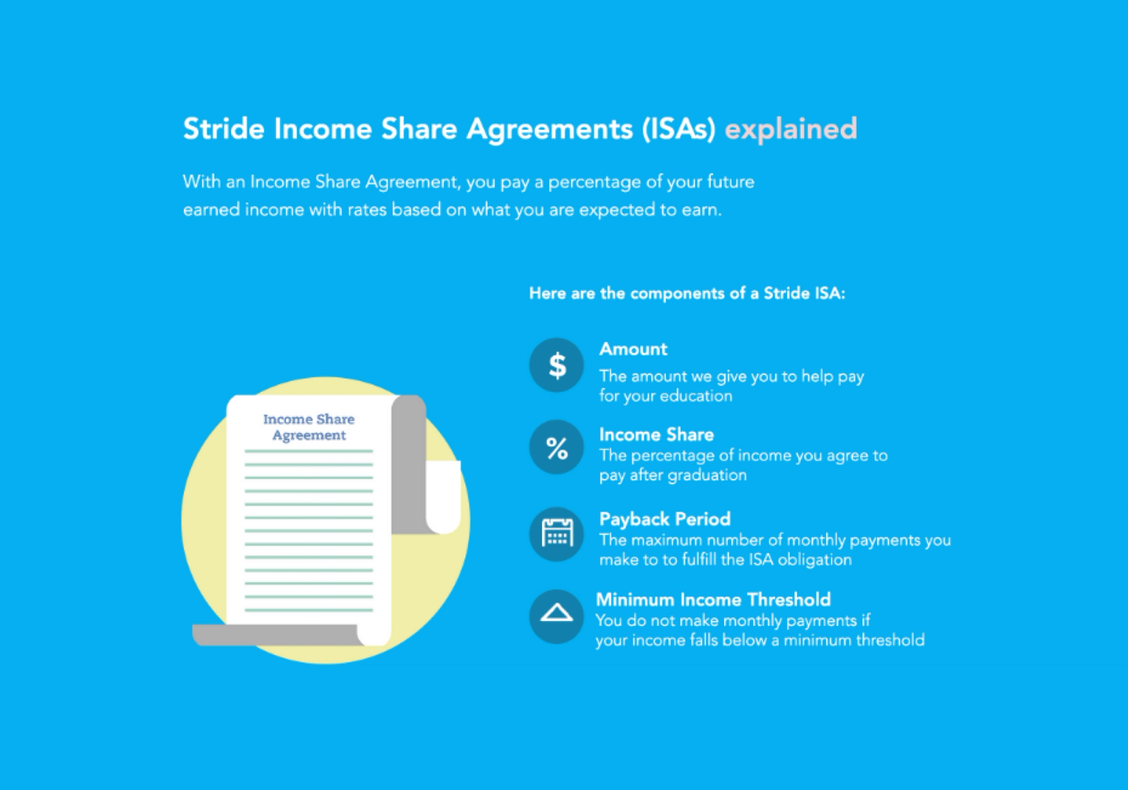
Stride’s hero product is an income-share agreement, which allows students to pay back funding based on a percentage of their future earnings.
Stride had been in market for several years and approached our team to revamp their brand, messaging and digital experience.
The goal was to better showcase and explain their products, while presenting themselves as a modern, consumer-friendly brand.
The problem
In our audit of the existing site, messaging and brand, a few things were clear:
We needed to do a better job explaining income-share agreements. The current site felt “textbook” educational and didn’t meaningfully highlight the value and optionality that ISAs provide.
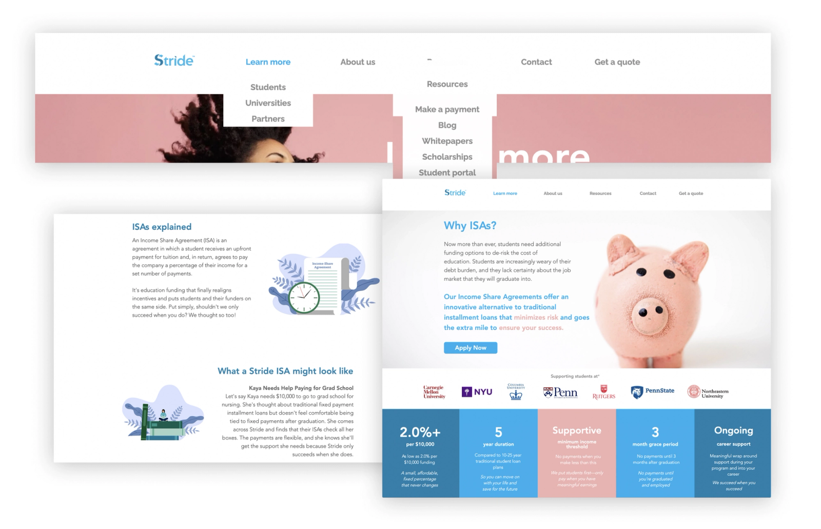
We needed to re-think the informational and navigational hierarchy of the site. There was repetitive content throughout the site and navigation was confusing.
We needed to modernize Stride’s brand identity. The color pallete, typography and stock imagery left the brand feeling dated and less than trustworthy for a financial services provider.
Explaining an Income Share Agreement
We are not lorem ipsum designers (meaning, we don’t design a site and put placeholder text for your team to fill in). We fundamentally believe that good design starts with good messaging.
We spend time deeply understanding the offering, intended audience, site analytics, competitive products, commonly asked questions or reservations, and then craft strategic, brand-forward messaging.
With Stride, here are a few examples of messaging before and after. Our copy was designed to read like a smart, older-sibling guiding you through what can be an overwhelming process.
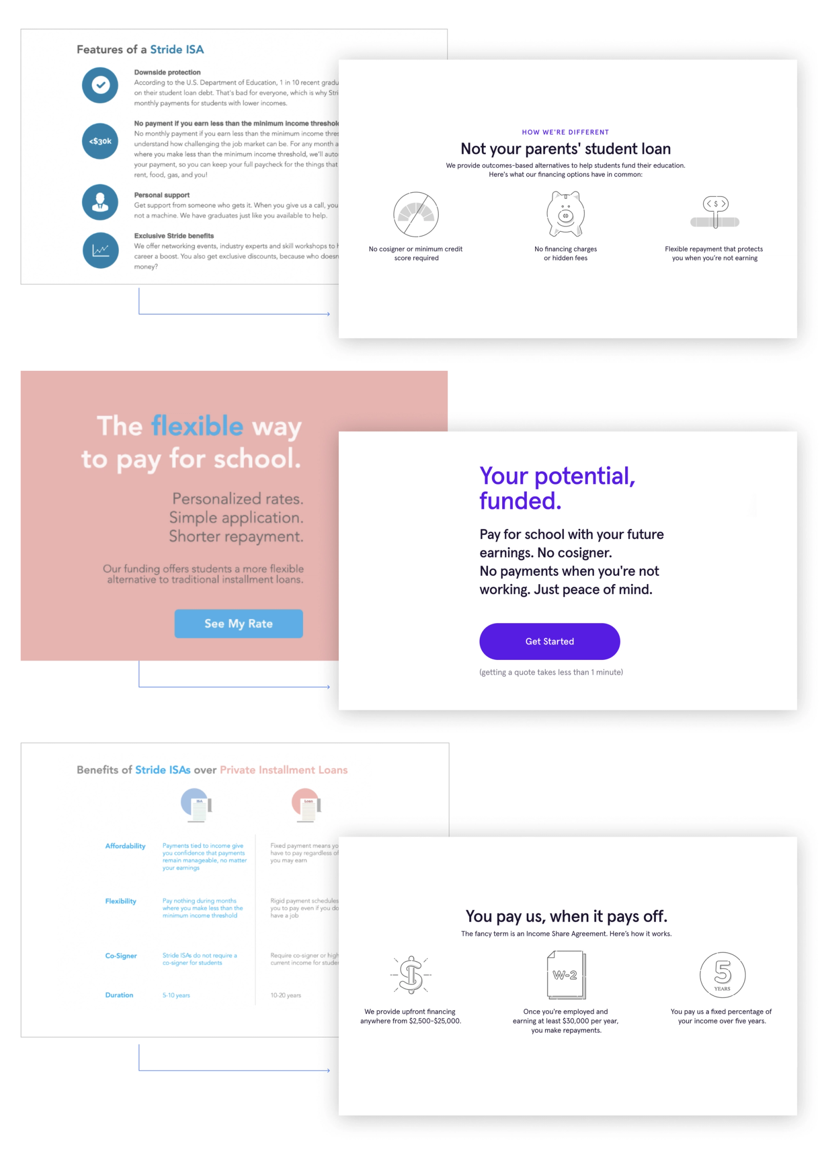
The end goal was simplified messaging that more clearly highlighted the value of a Stride ISA and did so with brand-forward copy.
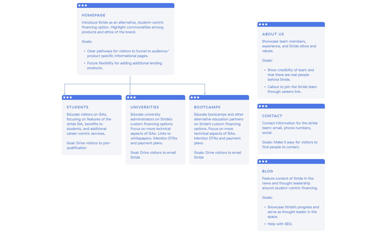
Site architecture
Good site hierarchy makes for an easily digestible and navigable experience.
Stride had evolved from a single, hero product intended for one audience, to multiple products for several audiences, but their site was built for the former.
The result was a patchwork of pages and hidden navigation menus that made for a confusing user experience.
We identified the intended audiences, relevant content, and desired outcomes, and mapped a site architecture that would allow for intutive exploration and easily digestible content.
A new brand identity
Through many conversations with the Stride team we defined our brand guideposts:
- Differentiate from other financial services providers — don’t fall back on commonly used aesthetics
- Convey a sense of weightlessness and relief — non-traditional feelings associated with educational financing
- Craft a simple yet memorable aesthetic
- Use illustrations, microinteractions, animations to bring the brand and messaging to life
- Stay away from photography as it tends to come off as cheesy and overplayed.
The aesthetic direction was to use a greyscale color palette with purple as the primary CTA and accent color
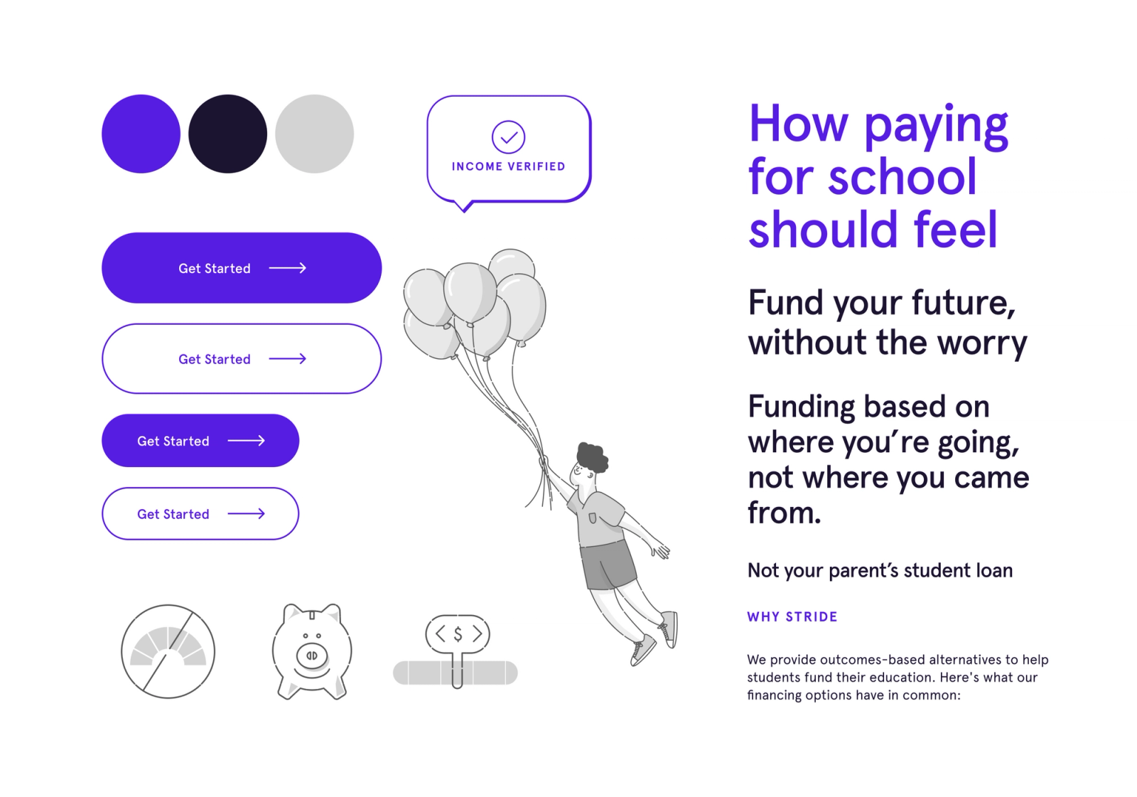
We conveyed a sense of weightlessness and relief with a custom character, who we illustrated and animated:
Outcomes
We worked with Stride over the span of 3 months on designing and developing a digital experience that will grow with them and their customers.